TO START...
To kick things off, we aimed to delve into the expansive domain of Fear. Knowing that it's a broad topic to get into, we sought a more specific path to navigate within this extensive subject. After much consideration, we decided to settle on texture aversion! We were drawn to the connection between visual imagery and the primal fear responses associated with certain textures, as imagination tends to take the wheel in times of fear.
Studies indicates that individuals are more likely to experience discomfort when touching different textures. This unique intersection provided us with a captivating and nuanced focus for our project, leading us to the creation of "Touchy Terrors."
Our project is Data Visualisation based, so we had to decide how to collect and showcase our data without doing too much, possibly overwhelming everything.
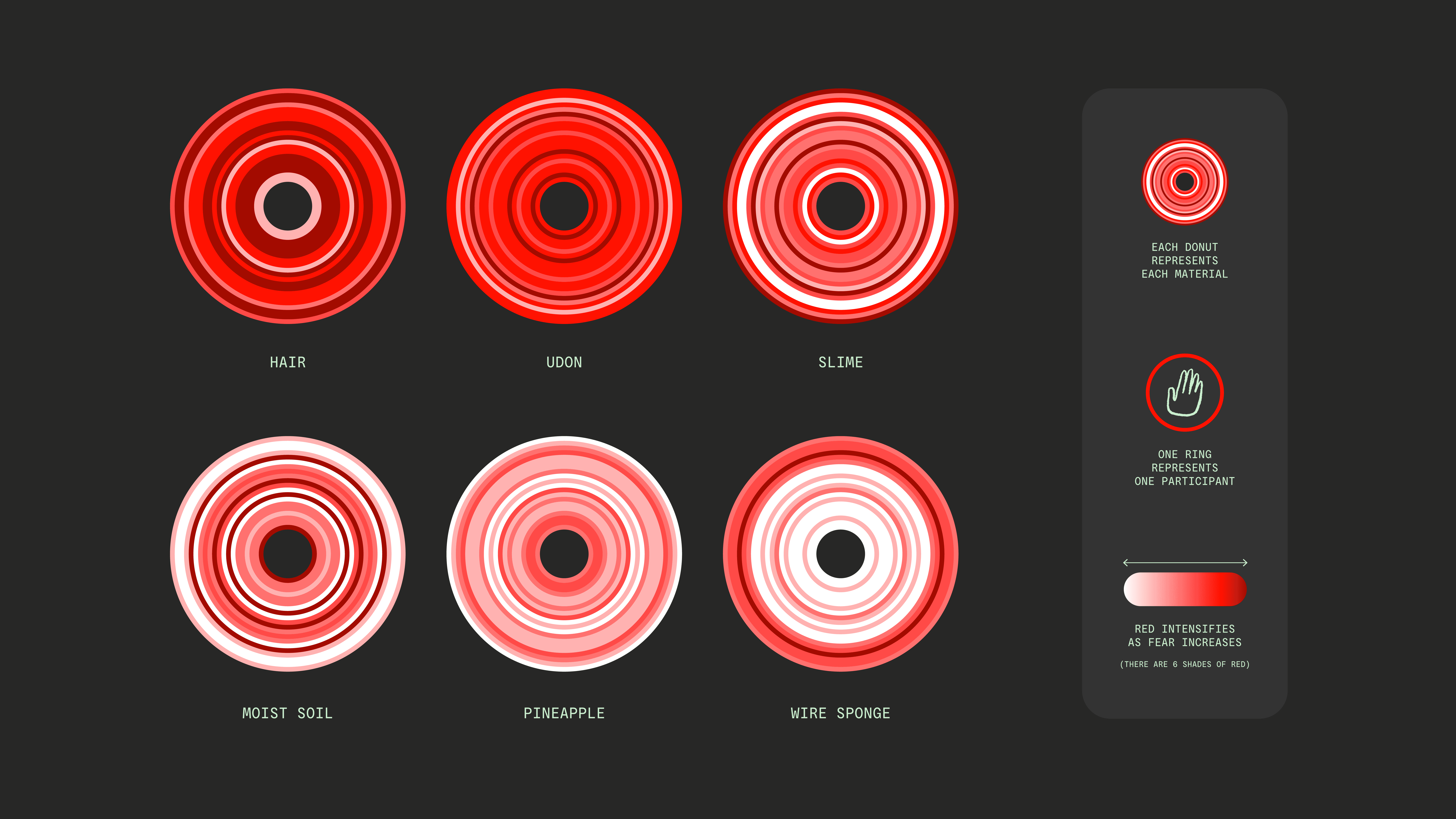
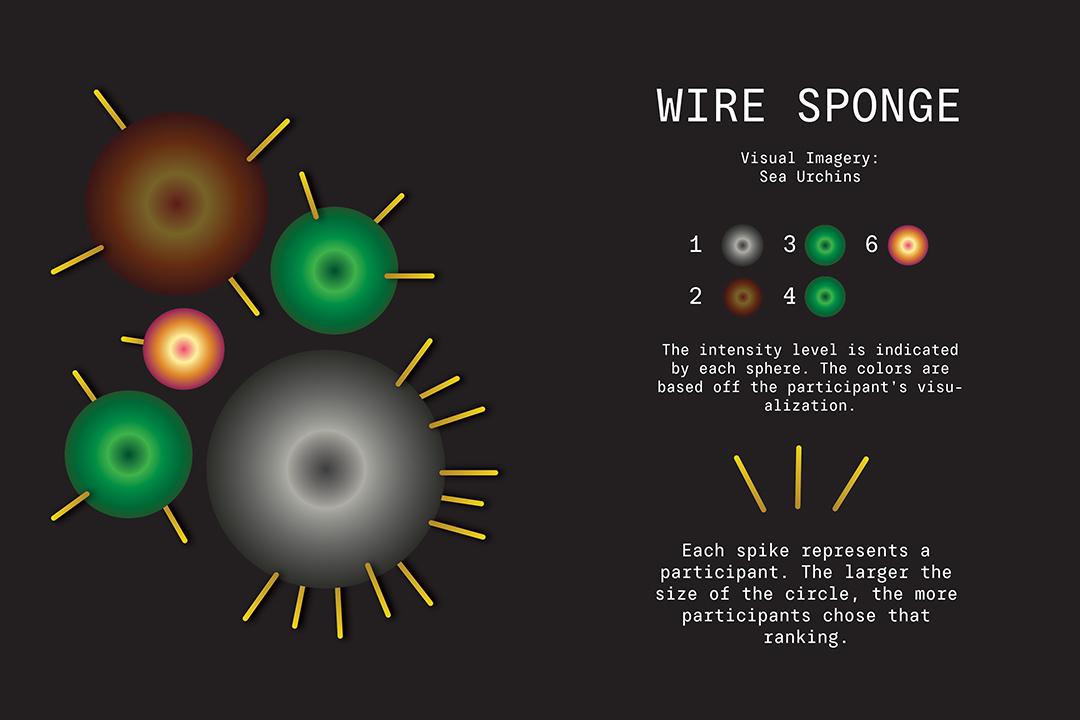
Our initial idea was to showcase 3 sets of data collected through our blind touch test: Fear rankings, Texture descriptions and Visual imagery. However, upon receiving Lecturers feedback, we realised that this was WAY. TOO. MUCH. INFORMATION. So, we cut it down to just visual imagery, as it was the most interesting path.
INSIGHTS
The blind touch test we conducted gave us lots of interesting insights. Long, stringy materials, such as hair and udon, was a consistently most feared textures. Contrasting this, hard materials were least feared, highlighting a spectrum of tactile preferences. Surprisingly, soft and slimy materials garnered equal levels of fear, indicating a shared aversion. Notably, participants found the idea of materials being of human origin most repulsive, despite assurances of hygiene. (anything that felt light to them scared them.)
Apart from the actual data collection, we learned one huge thing: WE CANNOT TRY TO FEED A WORM A SHANGRI-LA HOTEL BUFFET. In short, data visualisation is meant to make data easier to read. However, we tried to put in every single data we collected into our artefact, which would make our artefact look so overwhelming to the point where viewers cannot absorb anything. We had to prioritise data.
DATAVIZ
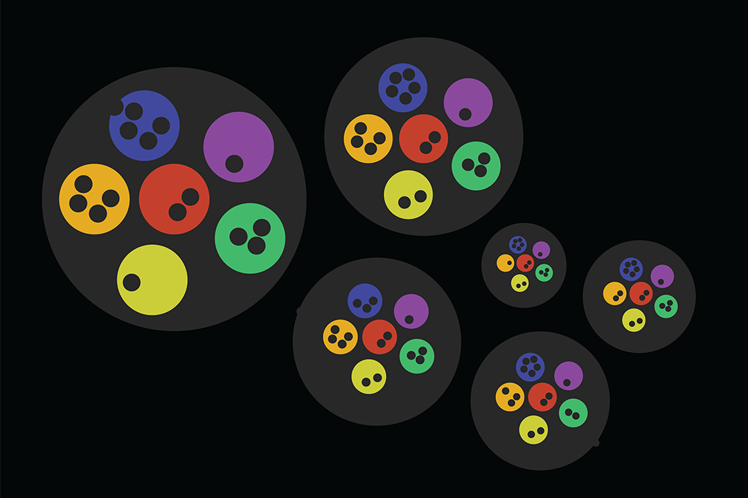
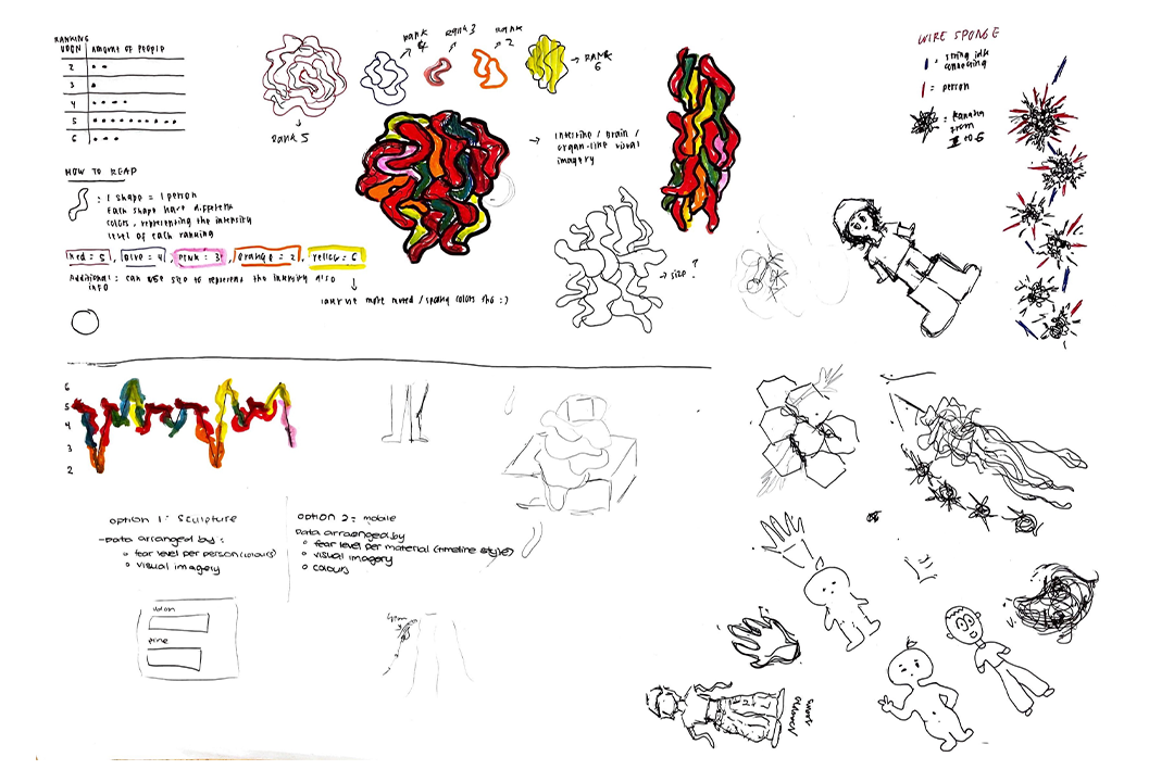
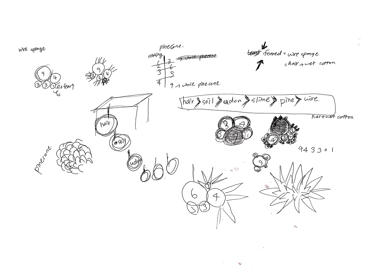
Based on the data collected from the blind touch test, we came up with different ways to showcase it in ways that create a different perspective when read. One way was to create it piechart style, where each material tested was represented by one large circle, and the rest of the data related to that material would be inside the large circles.
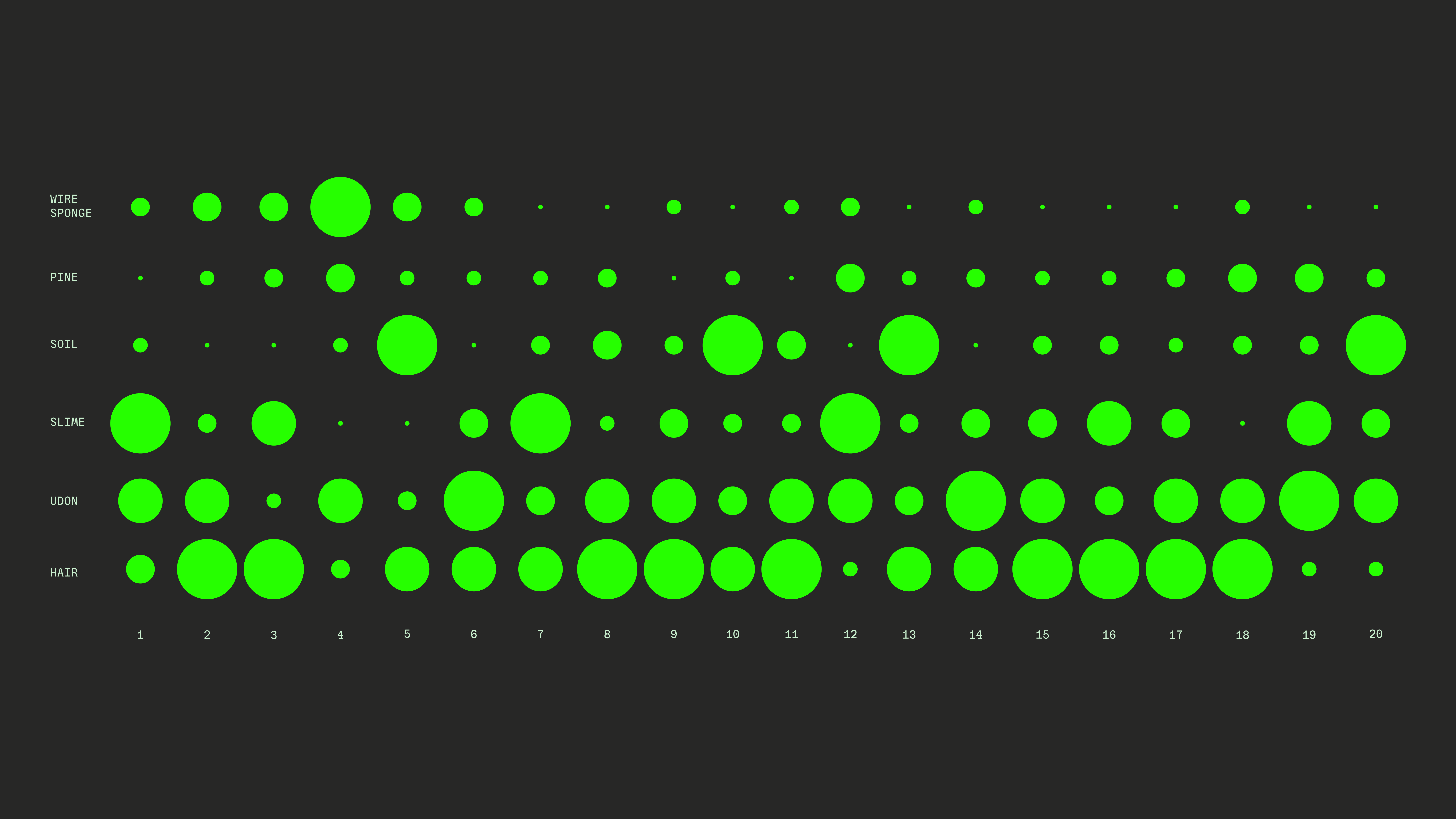
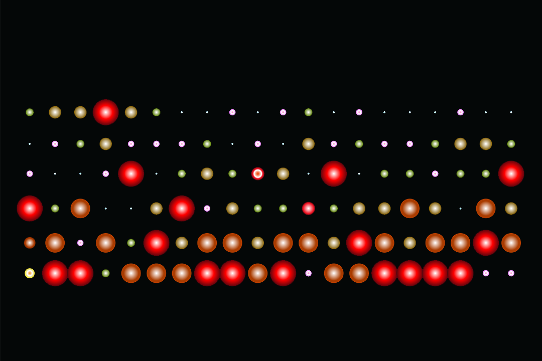
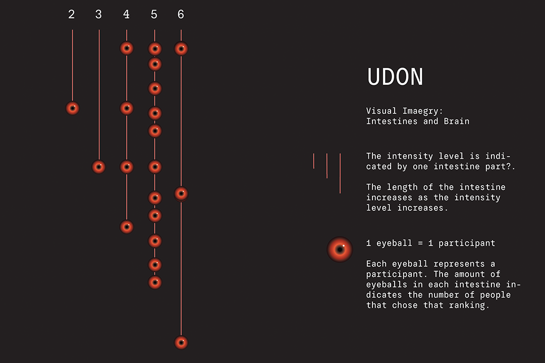
Another method we experimented with was the timeline style of data visualisation. In a way, you could also consider it a bar graph-style data viz. Each material was represented horizontally, and each person who took part in the blind touch test was represented vertically. The size of the circles in this graph above was determined by the fear reaction of the participant. The larger the circle, the more scared/disgusted the participant was.
DATA TRANSLATION
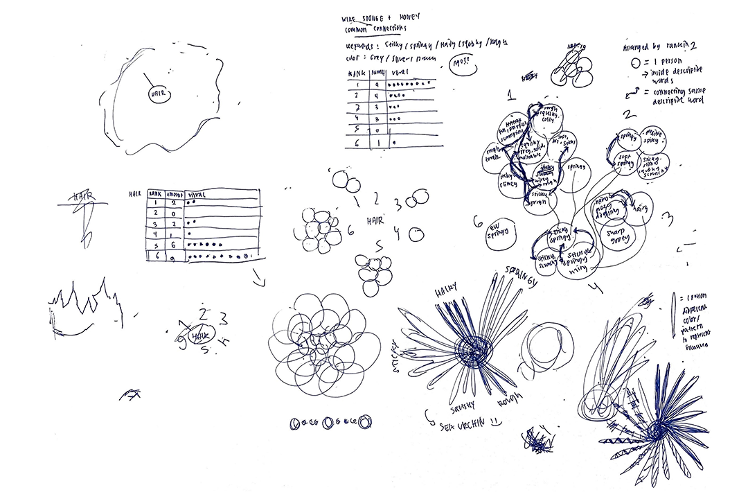
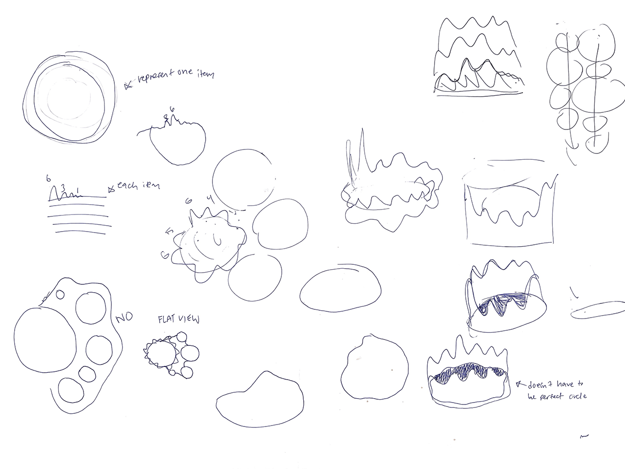
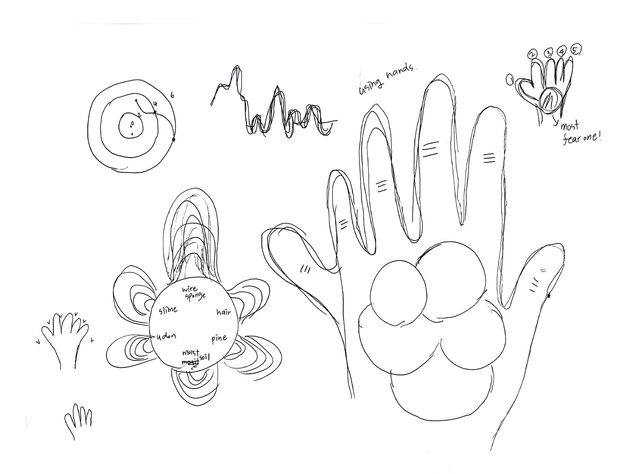
We needed to find a way to visually represent the collected data while integrating all the materials to create a cohesive visual imagery. Given that our materials encompassed items like food that could spoil, we had to explore alternatives to replicate them within the artefact as well. The process involved translating these considerations into sketches to get a better understanding of the ideas.
Additionally, we planned on creating a booklet that expanded on these sketches. The content of the booklet indicates what each part of the artefact represents in detail and describes how our data is visualised. Although this booklet was scrapped, it still created a better understanding of our though process when creating the artefact.
DESIGN DECISIONS
Our artefacts were mostly inspired by the participants’ fear reactions. During the touch test, we asked the participants to express the visual imageries and the colours they had in mind as they were handling the different materials given to them. With the interesting responses we got from the participants, we were able to come up with the and incorporated them into our artefacts.
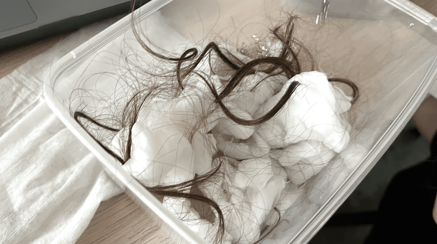
The artefact designs we came up with were based on the amount of similar responses we had or the imageries that we found most interesting. For one of the artefacts that we were creating which is the Hair + Cotton Ball, many of the participants stated that the texture of this material felt similar to wet hair that is commonly found on floor drains in the toilet after a shower. Similarly for the Udon + Sauce + Lychee artefact, some participants said that it felt as though they were touching eyeballs and intestines. Using these visual imageries, we were able to use them as reference as we constructed our artefacts.
CHALLENGES
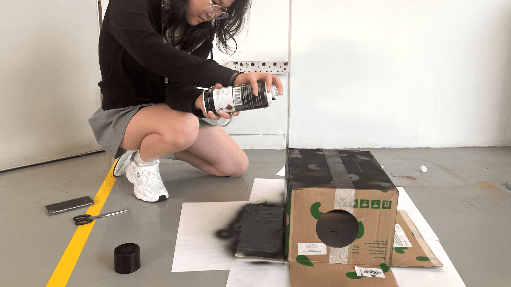
The process of selecting a topic and choosing materials for the artefact was quite time-consuming. We spent a lot of the time trying to figure out ways to present the data for each material. We looked for a lot of substitutions due to the extensive use of food in the touch test. While searching for substitutes, we used a lot of clay, which can be freely shaped. However, the clay weighed a lot after it hardened, and it became heavy as the various ingredients were combined. These problems resulted in materials that could not be hung on the mobile.
By week 14, we only finished three materials. After the feedback, we changed our approach to design the artefact. As we proceeded to create a photobook, we didn’t have to strictly rely on the mobile idea, and instead focused on creating the visual imagery. Hence, creating the last 3 artefacts was more time-efficient and we could still produce a high-quality outcome through the photographs, emphasising on textures.
FEEDBACK
The flexibility to adapt and integrate feedback has been a key aspect of our project, ensuring that each phase contributes meaningfully to the overall narrative.
The feedback we received throughout our project, particularly from Jo, played a pivotal role in shaping and refining our approach. Jo's insights, particularly as a trial participant in the touch test, proved to be valuable. Her suggestion to mix the materials into one, adding an element of unpredictability and heightened discomfort, significantly enhanced the impact of our experiment. We got participants' genuine reactions, ranging from disgust to fear, aiding the visual associations of their experiences.
During our Week 14 presentation, the feedback prompted a critical reassessment of our project's direction. First, It was also stated that we shouldn't focus too specificly on the dataset collected in our physical artefacts too avoid having too much information. Recognizing that our efforts felt more like a collection of experiments rather than a cohesive final outcome, the suggestion to create a photobook emerged as a solution. This shift allowed us to consolidate our testing, data, and experimentation into a comprehensive archive, providing a visually compelling and unified representation of our journey.
ACHIEVEMENTS
A huge roadblock we conquered was picking the data to display. We had a lot of issues in terms of clarity, and found that we were putting in too much data for something that was meant to be simple and readable.
We found that the way to solve this was to really strip off all the details and go back to basics. This began with us double-confirming our objective. From there, we decided to prioritise what data was most important to us (visual imagery), which is how we solved our issue.
